
KeyBank EasyUp
TL;DR Why the Redesign?
rolled out by marketing 3+ years ago; maintained by no one
predates design studio, design system, & accessibility guidelines
bank’s overarching goals shifting as regional banking falls on hard times
ownership for Money Movement squad
**Disclaimer: this is a short, high-level overview due to the highly sensitive and regulated nature of working within a financial institution

current state (left): separate journeys/visuals of user finances, design proposal (right): distinct parallel journeys for savings & debt
**images are representative in nature and intentionally small due to NDA*
Let Me Upgrade You
In addition to overcoming issues we diagnosed from the current state testing (difficulty automating debt pay down, disparate but similar experiences for savings vs. debt), we wanted this redesign to do more.
If we could get down to the root behaviors that encourage people to stay the course with working towards financial goals, this would significantly increase engagement and perceived value for interacting with the EasyUp feature, we’d also help the business in its overarching goal of increasing deposits and decreasing debt.
At the same time, we didn’t want to take things too far, since EasyUp’s current design generates tens of millions of dollars on a monthly basis.

Design’s overarching goal: shift the one-and-done set it and forget it tool to something that keeps clients coming back and provides constant value for their holistic financial well-being,
End Game
Like most large enterprise organizations, Key is focused on business objectives ahead of user needs.
By proactively identifying EasyUp’s weaknesses in order to get it prioritized on the roadmap with enough time to run the full design process, we set out to create a tangible case study that serve as proof of design’s ability to successfully achieve solutions to satisfy both.

Iterations from following the entirety of the design thinking process
Personalization
43% of users interviewed don’t count on their bank to give them individualized attention and strictly use their accounts to hold and move money.
EasyUp’s redesign proposal included features such as:
specific, individualized saving goals
memos
entry point to powerful financial wellness review tool


Visualization & Gratification
71% of users interviewed felt encouraged or incentivized by seeing savings progress or projections of where a savings strategy could help them land.
To meet that need, we proposed:
savings strategy visual incentivizes users to increase deposits
all-time EasyUp savings/debt pay down shows financial gains over time
total monthly savings showcases how EasyUp relates to bigger savings picture


Consolidation
93% of users agreed or strongly agreed that having a road map for reaching debt and savings goals is important.
Our solution for redesign included:
savings strategy visual incentivizes users to increase deposits
all-time EasyUp savings/debt pay down shows financial gains over time
total monthly savings showcases how EasyUp relates to bigger savings picture


A Meta Retrospective
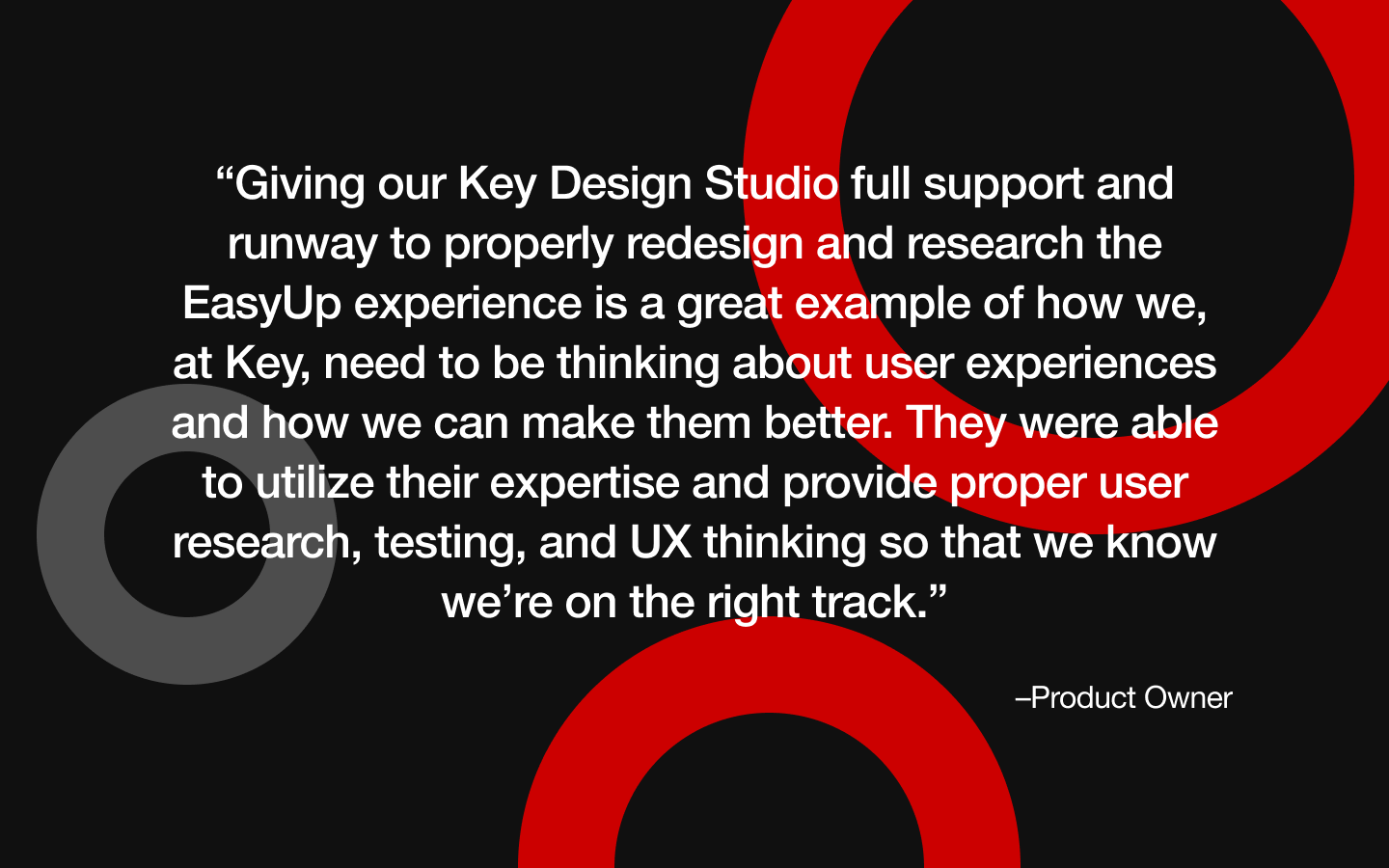
Our long-term planning and positioning of this project as an example for design to illustrate that providing users value=driving business objectives, we were able to get a powerful testimonial that was shared in an email newsletter with all of our product partners, amplifying the design studio’s value across the organization.
Next Steps
Refine
Align as a squad on technical feasibility and approach of MVP concept; make updates.
Validate
Test high fidelity updates to dashboard; retest critical tasks.
Ship MVP; Fast Follows
Ahead of our Q1 2024 ship date for this redesign, we need to define metrics for a successful MVP. From there, we need to release our backlogged enhancements.