
Amintro Design System
The Client
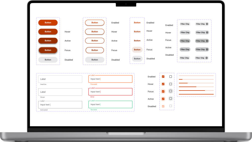
Amintro’s design system starter kit in Figma
Amintro leads the social media market for senior citizens looking to make friends who they can interact with in-person.
Amintro wants to evolve beyond its minimum viable product and 5x its existing user base, but a third of new users abandon the onboarding process. Our team agreed that streamlining the onboarding flow with the goal of reducing profile creation abandonment rate would maximize the impact on Amintro's overarching business objectives within the time constraints and set our client up for future success.
Constraints
•60 hour deadline
•Distributed team across 5 different time zones in US, Canada, & South Africa
Deliverables
•Design System Starter Kit
•Onboarding User Flow 2.0
•Design Handoff Documentation
Responsibilities
•Defined sprint roadmap
•Managed scope creeping, client expectations
•Led design team standup calls
•Incorporated design assets to Jira tickets
•Spearheaded cadence for product backlog
Research
Establishing the baseline for Amintro's new onboarding experience
Insights we kept in mind throughout the design process included:
•Text input has a negative impact on our target audience of senior citizens due to age-impacted manual dexterity deterioration
•Approximately 1/3 of adults 65 and older are impacted by vision-reducing disease
In supplement to the research, I leveraged best practices from industry standards to find key indicators of high performing design systems and used them as benchmarks for design research, such as:
•Increasing minimum touch target sizes (Apple's Human Interface Guidelines)
•High color contrast (Web Content Accessibility Guidelines)
•Negative space for overall clarity (Apple's Human Interface Guidelines)
•Qualifiers and filters to match users (Google's Material Design)
Design Audit
The goals of the design audit were to:
•Target points of the onboarding flow that cause friction and lead to profile creation abandonment
•Uncover inconsistencies in the existing design
•Assess overall performance
Results of audit brought forward the following areas to address:
1. Lack of responsive experience
2. Poor accessibility
3. Excessive cognitive load
4. Lack of indicators and two-way communication
5. Inconsistent experience
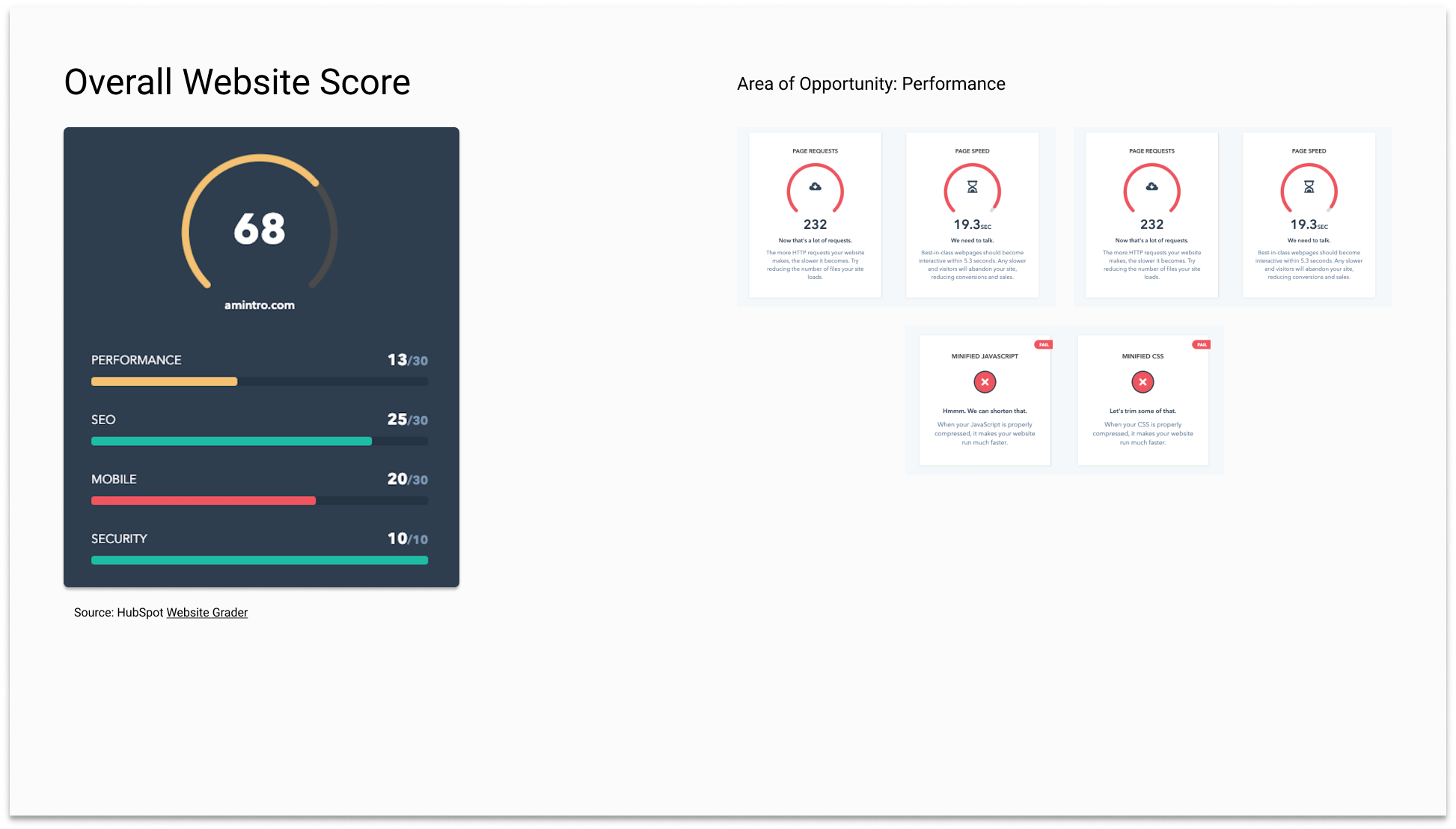
Gauging overall performance with HubSpot's Website Grader
Responsive Experience
I deployed a consistent foundation across multiple breakpoints in the form of an 8 pt grid system and increased mobile touch targets to minimum 44x44px (adhering to Human Interface Guidelines' best practice) to overcome the obstacle of failing Google's mobile-friendly test.
This update creates a more cohesive experience across multiple breakpoints and mitigates jagged, pixelated edges from appearing since the majority of prevalent devices on the market are divisible 8 px.
Problem: not so mobile-friendly experience
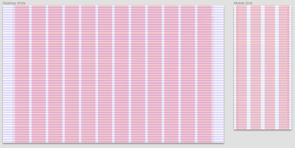
Solution: 8 pt grid system serves as the blueprint for our redesign (desktop, mobile)
Increase Accessibility
The next order of business was to move away from the current contrast ratio ranging from 2.68:1 to 3.52:1 for many prominent UI elements and size 14 px, medium weight body text by only using the primary brand color for the logo and increasing saturation for interactive elements as well as increasing the body size text to 16 px and increasing small (footer) text to weight to semibold.
Another shift that created a more accessible interaction was using an off-white, rather than the previously selected pure (hex code #FFFFFF) white to reduce eye strain.
The relaunched component library is entirely WCAG AA compliant; many items are WCAG AAA compliant (WCAG AA min: 4.5:1 contrast ratio for normal text, 3:1 contrast ratio for large text/UI elements).

Problem: less than optimal accessibility palette
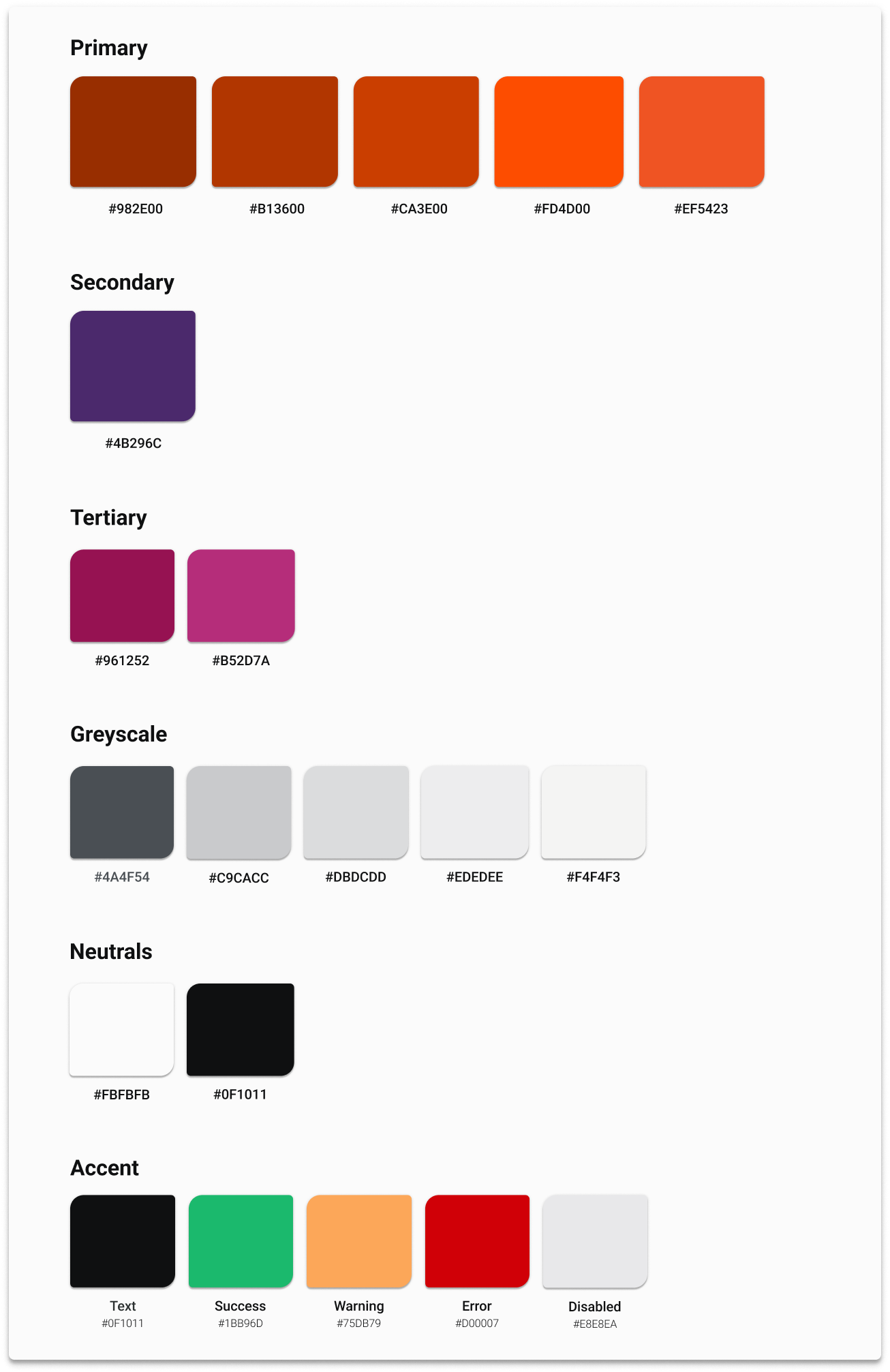
Solution: new and improved color palette caters better to Amintro's user base by prioritizing accessibility
Reduce Cognitive Load Regarding User Input
Amintro’s current onboarding flow features 17 screens and many questions require paragraph form text responses.
We elected to shift to components including checkboxes, radio buttons, selection chips, and dropdowns as it will reduce cognitive load that causes frustration and ultimately drop off in the onboarding process.
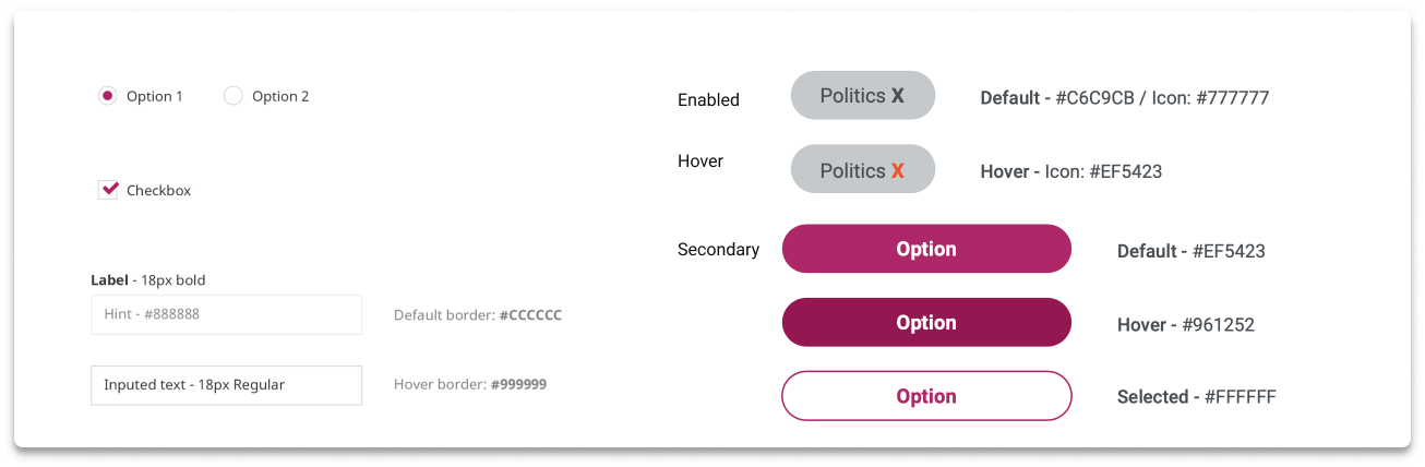
Before: The process demanded significant cognitive load for user input and used secondary buttons as filter chips while relying heavily on text input
After: Streamlined User Input Components with strict rules for usage
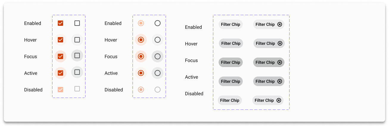
Encourage Interaction with Real-Time Feedback
Deserting our users on a 17-page onboarding process without any transparency about their status left the door open to provide more two way communication.
We deployed indicators on status (success, warning states) as well as landmarks for where a users stands within the product, rewarding them for their input and encouraging them to stay the course of profile creation.

Before: only indicating error state
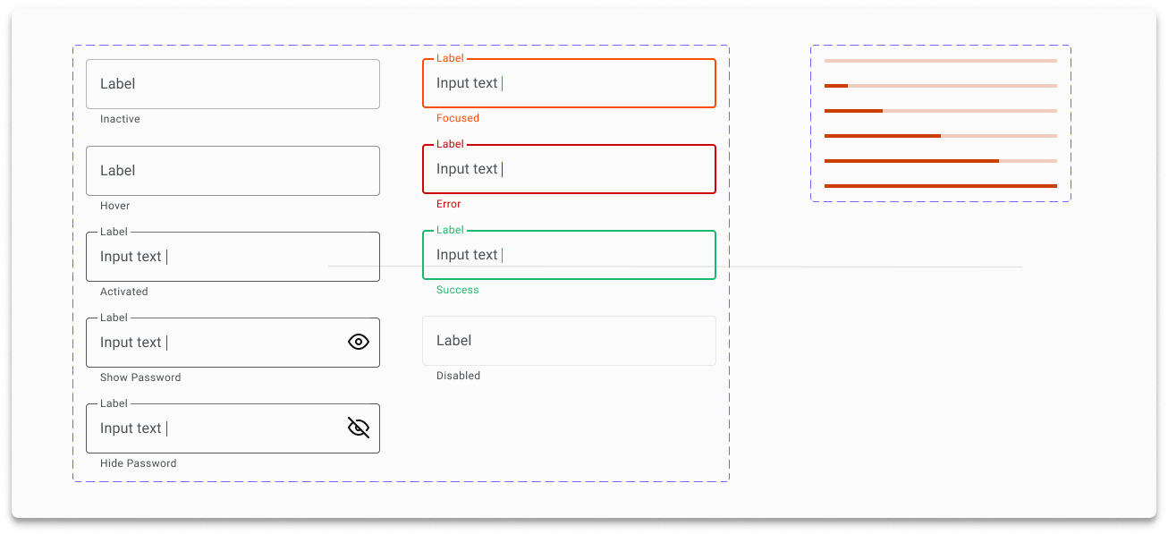
After: components created for transparency and clearer communication
Build Trust through Consistency
Letting users know what to expect via cohesive assets across a product builds rapport over time so I elected to replace the existing icon stack which had a mix of outlined and filled styles to a new one featuring minimal, consistent styles.

Carrying this over to a strict adherence the color palette, I eliminated the six tones being used that were not outlined within the preliminary brand guide.
I also advised the team to update the error color to a less orange-y red to a deeper, darker red to avoid having users subconsciously associating the brand with errors.

Impact
On the User: Providing familiarity and consistent measures of usability and accessibility increases the likelihood for onboarding completion.
On the Product: This single source of truth facilitates continuity and coherent behavior across the entire platform.
On the Team: Our centralized components library sets the cadence for direct mapping to the backlog, enabling faster code development (faster to market).
Next Steps
Expansion: Continue building component library from backlog.
Maintenance & Awareness: Roll out across design, engineering, and product team with the aim to increase adoption; if everyone isn’t using it then it serves no purpose.
Testing: Gauge user feedback on our new look to iterate and improve the starter kit.